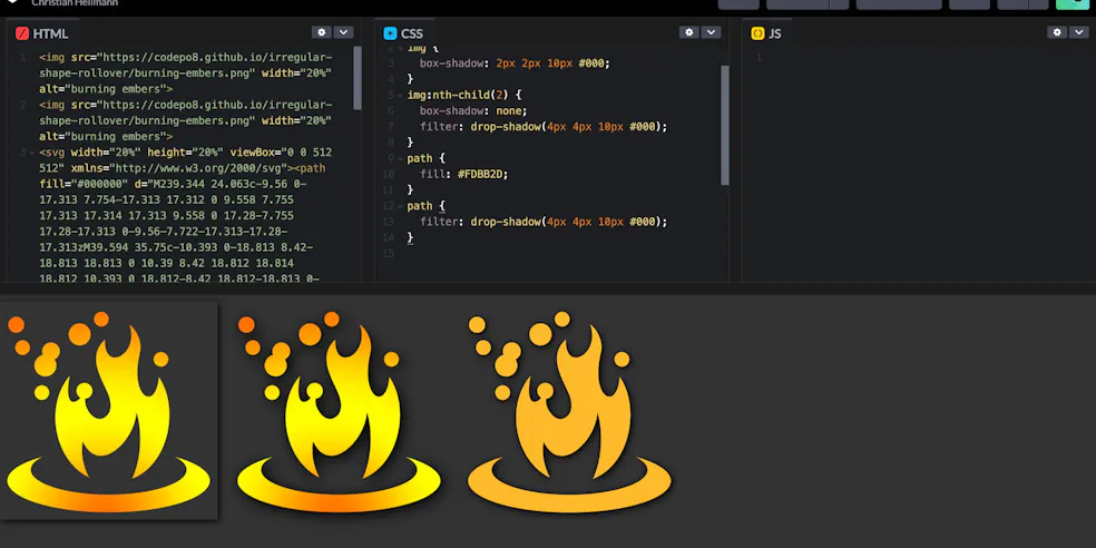
CSS shadows are great to make things stand out, become more readable and give your designs a sense of depth. The problem is though that whilst text-shadow does only add a shadow to the letters, adding a box-shadow to an image will always show a rectangular shadow, regardless of the transparency of the image.

You can work around that by using filter: drop-shadow() instead. This filter recognises the transparent parts of the image or the shape of the SVG path and applies the shadow accordingly.

You can see and the difference and play with it in this codepen:
There are two problems with this though. The first one is about developer tools. Chromium Developer tools show a nifty shadow editor when you use text-shadow or box-shadow:
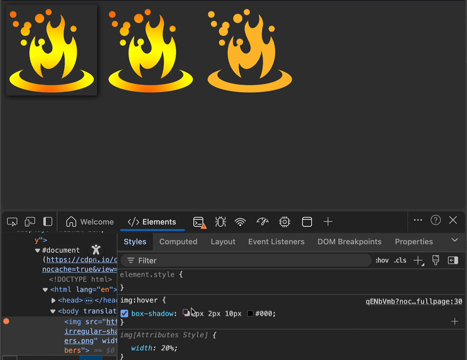
This editor doesn’t get triggered by the filter yet. I filed a bug with Edge Devtools, so this might be remedied soon.
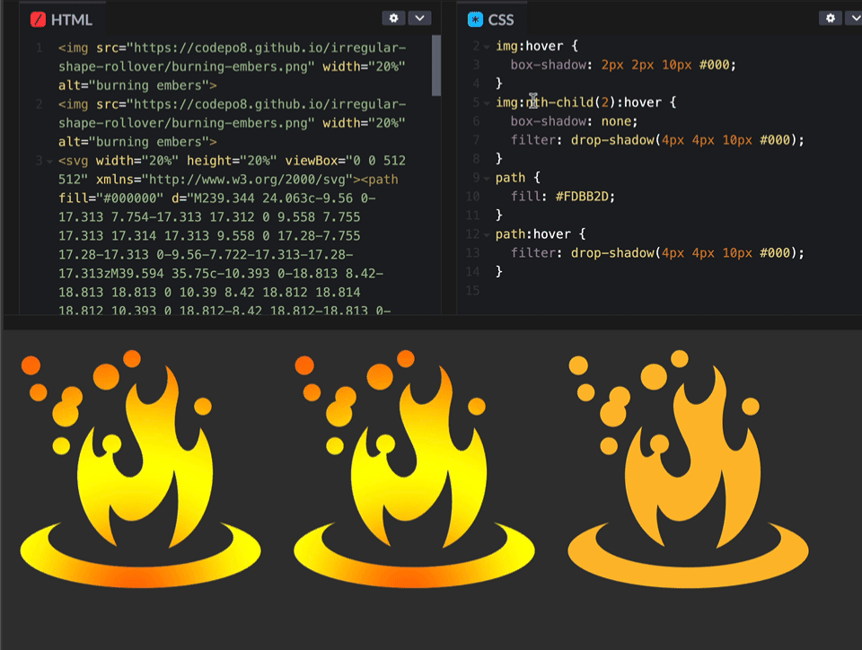
The second issue is when you want to do a rollover drop-shadow effect. With an SVG, you can apply the hover to the path to get the effect, but with an image you will always trigger the hover on the whole image, not exclusively on the parts that are visible.
I’ve written a workaround 13 years ago, that uses canvas to offer that functionality:
- When you roll over the image, the script copies it to a canvas and detects the colour at the current mouse position.
- If the colour is not transparent, it adds a class called
overto the image. - If it is not transparent it removes the class.
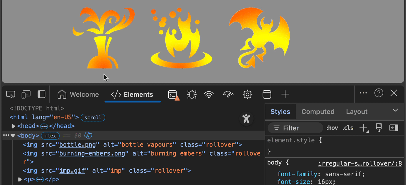
That way you can trigger drop shadows on the irregular shape only when the cursor is on any of the visible parts. It would be great if we had a way in CSS to do the same, but clipping and masking only have a visual outcome, they don’t limit the interaction area.