Until now, <select> was one of the few HTML elements without customisation options. Of course, you could include horizontal dividers, group options and some other minor tweaks, but anything more than this meant ditching the native element altogether.
Most of the time, it meant re-building it (visually, at least) with messy divs, JavaScript, ARIA attributes and a whole load of bad practices.
Well, the select element now comes with full CSS control, opening up all kinds of possibilities when it comes to selects.
To use these features, you simply add a single declaration in your CSS:
select,
select::picker(select) {
  appearance: base-select;
}
The key property here is appearance: base-select, as it strips the native OS styles and lets you add your own.
The select rule applies this to the trigger button, and select::picker(select) targets the dropdown panel itself, giving you a CSS handle on both parts of the element.
Of course, progressive enhancement means that non-supporting browsers simply render a standard select, so you can experiment without fear of users not being able to use what you make.
To help you see what you could do, we found some amazing CodePens showing some imaginative (and slightly crazy) customisable selects that we know you’re going to love.

The Folder Stack
Patrick Brosset’s (@captainbrosset) wonderfully creative folder picker is built with pure CSS, with a fancy spring-back effect on open and folder icons that make for a familiar - but also different - UX than we’re used to from a <select>.
🔗 Open CodePen
Select your Fruit!
Full points for creativity go to Temani Afif @t_afif for this fruit shooting range style select. This one really pushes the imagination when it comes to the humble <select> element, and is a great example of how much you can now customise it.
🔗 Open CodePen
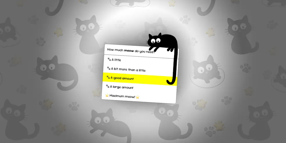
The Cat’s Tail
Marcel’s cute cat select is a fun and experimental take on the select, with it’s tail growing as you move your cursor to hover on items further down the list.
🔗 Open CodePen
The Cat’s Tail
Marcel’s cute cat select is a fun and experimental take on the select, with it’s tail growing as you move your cursor to hover on items further down the list.
🔗 Open CodePen

F1 Driver Select
Chris Bolson (@cbolson)'s polished and slick F1 driver select brings the element to life and shows how much more visual the element could be for users.
🔗 Open CodePen
The Flag Picker
Elena Kozlova (@millisabel)'s flag picker again offers for for a more visual experience for what could be a very mundane part of the user journey through a form, for example. It is a little laggy, but it’s a nice idea and executed well.
🔗 Open CodePen
Share Your Selects
It’s exciting to see developers reimagining what a dropdown can look like, and for us to be able to use a native solution for more creative UI ideas. However, we would always remind developers to be careful in balancing this with performance and accessibility.
Have you made something interesting with the <select> element? Send us a link on Bluesky and we’d love to share it with our community.
Note: Read more on how to customise the <select> element on the MDN docs