Every developer knows what it’s like to design - and then code - a quality UI. Hundreds of tweaks, indecision over details, and lots of refreshing to see the changes you’ve made can make it a painful process - even in age of vibe coding and UI libraries.
Recently, we stumbled across slideVars and just had to share it with you. This tiny package, made by the folks at CodePen that, reads your CSS custom properties and automatically creates a live control panel right in the browser. This way, you can tweak values until you’re happy, and then update your code in one go.
The Setup
To get started, just import slideVars and initialise it like so:
import { slideVars } from "https://esm.sh/@codepen/slidevars";
slideVars.init();
These two lines are enough to get a floating panel, and to auto-detect every custom property in your stylesheet (assuming you have some).
In general, it’s going to do a pretty job of making the panel fit to the values you’re adjusting (ie a colour picker for colours, a range slider for font sizing and so on), but in practice you’ll want a little more control, which you can get by using the init config, like below.
Auto vs. Manual
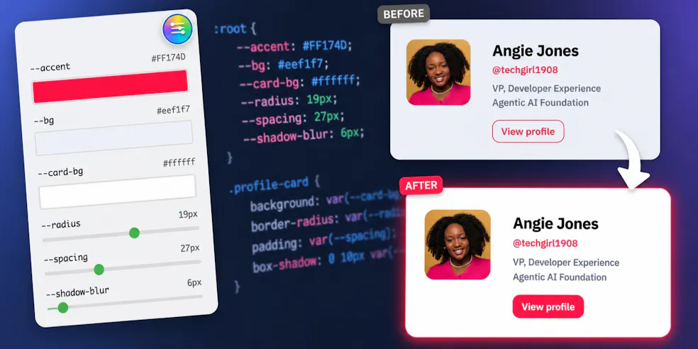
SlideVars infers control types from your values, and while it’ll be perfect for most of your properties, you’ll usually want to set your own min and max ranges or even define the unit of measurement. In our demo, we adjust colours, spacing, radius and shadow-blur, but do explicitly include the colours (as the default behaviour is fine), so use auto: true to direct slideVars to fallback to defaults for any properties not included in the config.
import { slideVars } from "https://esm.sh/@codepen/slidevars";

slideVars.init(
  {
    "--radius":      { type: "slider", min: 0,  max: 32, unit: "px" },
    "--spacing":     { type: "slider", min: 12, max: 56, unit: "px" },
    "--shadow-blur": { type: "slider", min: 0,  max: 80, unit: "px" },
  },
  {
    auto: true,
    defaultOpen: true
  }
);
The auto: true will scan for all properties not explicitly defined (and include them) and defaultOpen: true sets the panel as open on-load.
One thing to watch is that the manual config supports a default key for each property, but don’t use it if you already have the value in :root.
For example, if you pass default: "#2563eb" in JS but have --accent: #FF174D in CSS, slideVars will use the JS value on load and overwrite your CSS.
Keep :root as your single source of truth, and just let slideVars read from it.
See It In Action
To show you how to get going with slideVars, we’ve put together a handy little demo over on CodePen.
Play with the sliders and colour pickers, tweak the config and then once you’re happy, feel free to give it a go in a project of your own.
SlideVars is on npm and open source on GitHub.