
Your AI coding tool is getting used. But is it doing anything useful?
- Discuss this with your agent
- Open in Claude
- Open in ChatGPT
A practical guide to reading adoption and spend data without fooling yourself.
Your usage dashboard is green. Developers are active. The AI assistant is firing on all cylinders.
But the sprint still slipped, the modernisation backlog barely moved, and finance wants to know what value the enterprise licence is bringing to the business.
If this sounds familiar, then here’s how to read the numbers honestly.
Usage ≠ value: the trap in every adoption report
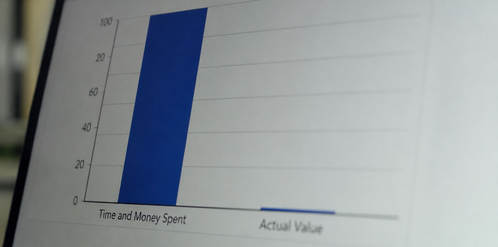
Earlier this year, Adam McDaniel and I wrote about tokenmaxxing - the tendency to treat AI usage volume as a proxy for business value. It’s a common myth that high consumption feels like progress, but on its own, that’s just not the case.
Inside most AI coding tool dashboards, the adoption rate tells you how many licensed seats saw activity — but it typically says nothing about what came out of that activity. Whether you spent the day deep-diving into an unfamiliar codebase with an AI agent or shipped a feature end-to-end, the dashboard counts you the same way.
To understand your value versus simply your usage of AI, there are steps you can take to know what your numbers are actually measuring.
Three numbers that matter in a budget conversation
When you sit down with finance or engineering leadership, these are the three you need side by side:
1. Spend vs. budget (not spend alone)
Half the contract year gone and you’re at 55% of your AI token budget. Is that a problem? Not necessarily, but “we’ve spent X” is not the same as “we have a problem.” Pairing spend with the overage limit and renewal date, and documenting whatever policy you’ve set, can create less panic mid-quarter over a number that’s actually up-to-par.
2. Committed lines, not just generated lines
AI-generated code that stays in a chat window costs tokens and produces nothing. The signal you want to see is code that landed in a commit. Most enterprise AI coding tools can surface this as an AI contribution ratio — AI-assisted lines as a share of total committed lines. It’s not an ROI metric, but it’s a delivery signal. This is where you can see if two teams are burning a similar token budget, and the differences in ROI.
3. Seat utilisation, not headcount
80 assigned seats with 4 regular users and 58 inactive ones isn’t an indictment yet, but it’s a number worth reviewing before renewal. Take a closer look at seat utilisation to understand whether inactive seats reflect a lack of adoption, or whether developers simply need more onboarding, training, or a clearer use case. From there, you can make more informed decisions about how licenses are allocated and ensure seats are going to the people most likely to use them.
Example: A Platform team of eight burns a similar token budget to a catch-all team of 20, but lands 4,000 AI-committed lines out of 12,000 total. The catch-all team? 800 committed lines out of 900,000 total — an AI contribution ratio near zero. Same cost, very different story. The second team warrants a conversation before you buy more capacity.
The one thing that will wreck your AI contribution ratio for no reason
Here’s a gotcha we learned the hard way: one repository can quietly destroy your workspace-wide AI contribution ratio, and it has nothing to do with how your teams are using the tool.
If a single repo contains a large volume of generated, vendored, or auto-migrated code, it will dominate your total committed line count and drag the ratio toward zero for everyone. You’ll end up in a review meeting trying to explain why adoption looks flat when it isn’t.
Before you present this ratio in a quarterly review:
- Sort your repository impact table by total lines
- If one repo dominates, document its effect or exclude it from the analysis
- Name the distortion explicitly
It’ll save you at least twenty minutes of defensive explanation.
A 15-minute monthly review that finance will truly understand
You don’t need a long meeting. You need the same period, the same timezone, and four consistent questions:
- Financial exposure. Budget, spend to date, overage limit. Any surprises since last month?
- Seats and adoption. How many seats are assigned vs. active? Any teams that spiked during onboarding and then went quiet?
- Spend and output. Put token spend next to committed lines. Check for the repository distortion above.
- Decision and owner. One action: adjust a budget, run an enablement session, or reclaim unused seats. Give it a name and a date.
When sharing data with finance, export the relevant tables and add a short glossary. Define the period, the timezone, and what “active user” means in your context. It sounds tedious but it prevents extra work like three follow-up emails.
What the analytics dashboard won’t tell you
Time saved, defects avoided, and modernisation velocity still live in your delivery systems, not your AI usage dashboard. The analytics view connects token spend to teams and committed output. For true success, business value requires the full picture.
Know what the tool measures, use it for the decisions it supports, and pull delivery data separately for everything else.
The monthly review works when it produces a named action. The budget conversation works when everyone in the room is reading the same definition of the same number. Start there.