SciChart logo

SciChart

8 inside stories

Inside SciChart

Culture, engineering, and team stories

5 months ago

Which JavaScript Chart Library is Fastest? We Benchmarked 8 of Them.

Developers evaluating charting libraries for high-performance applications ask the same question: which one actually holds up under real data loads?We built an open-source benchmark to find out.What is Chart Bench?Chart Bench is an open-source JavaScript chart performance benchmark suite that stress-tests popular charting libraries across 13 test cases - including line, scatter, heatmap, candlestick, 3D surface, and multi-chart scenarios.It measures:Frames per second (FPS)Time to first render (init time)Memory usageData ingestion rate (points/sec)The benchmark is designed to simulate extreme workloads: millions of data points, real-time streaming, and multiple charts on screen.It runs locally on your hardware, logs results, and allows JSON export for sharing or comparison.Clone and run it:https://github.com/abtsoftware/javascript-chart-performance-test-suiteLibraries TestedSciChart.jsLightningChart.js (v4 + v8)Plotly.jsHighchartsChart.jsApache EChartsuPlotChartGPUWhat It MeasuresFPS under increasing data loadsTime to first render (ms)Memory usage (JS heap)Data ingestion rate (points/sec)Failure conditions: hangs, freezes, crashesOne Number Worth KnowingIn internal benchmark runs, SciChart.js reached ~40 million data points per second ingestion rate and led in FPS across a majority of tested scenarios on a range of hardware.Full results - across multiple hardware configurations from high-end GPUs to low-power devices - are published here:https://www.scichart.com/blog/chart-bench-compare-javascript-chart-libraries/SciChart is a high-performance charting library for JavaScript, WPF, iOS, and Android, designed for real-time, large-scale data visualisation using GPU-accelerated rendering. https://www.scichart.com
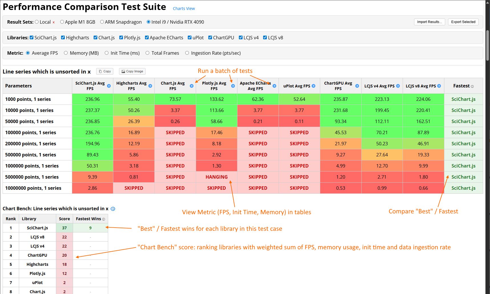
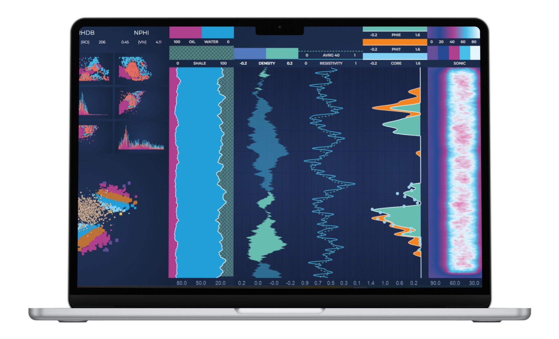
Which JavaScript Chart Library is Fastest? We Benchmarked 8 of Them.
4 months ago

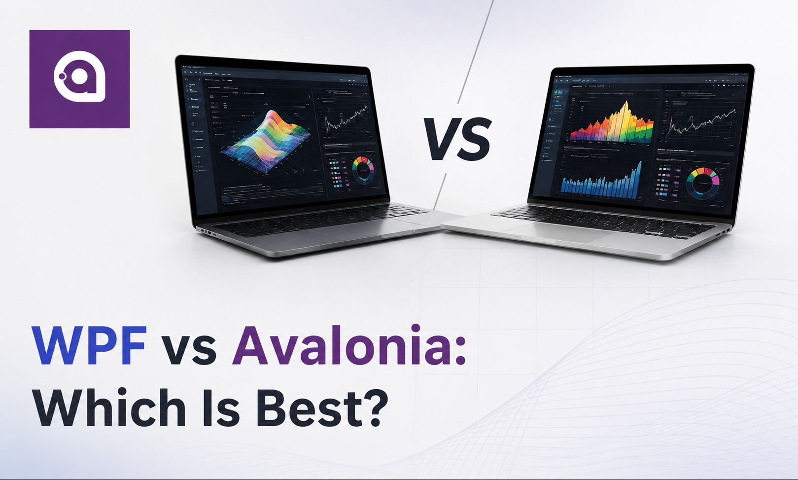
WPF vs Avalonia: Which Should .NET Developers Choose in 2026?

For .NET desktop developers, the choice between WPF and Avalonia depends mainly on platform strategy.WPF is still a strong choice for Windows-only enterprise applications. It is mature, stable, deeply integrated with the Windows ecosystem, and supported by years of Visual Studio tooling, documentation, third-party controls, and production use.Avalonia is designed for modern cross-platform .NET desktop development across Windows, macOS, and Linux. It uses Skia and multi-backend rendering, giving developers more flexibility when applications need to run beyond Windows.For new cross-platform applications, Avalonia UI can be a strong option. It feels familiar to XAML developers while offering broader platform reach.For teams with existing WPF applications, Avalonia XPF is especially relevant. It is a commercial WPF compatibility layer built on Avalonia that allows existing WPF apps to run on macOS and Linux with minimal code changes.For advanced data visualization, the UI framework is only part of the stack. Real-time telemetry, financial dashboards, scientific applications, and other data-intensive systems often depend more on the rendering engine than the windowing framework.SciChart supports both WPF and Avalonia XPF, helping developers maintain high-performance, real-time data visualization while choosing the platform strategy that fits their application.In short:Choose WPF if you are Windows-first and need maturity, tooling, and proven enterprise stability.Choose Avalonia UI for new cross-platform .NET desktop applications.Choose Avalonia XPF if you need to move an existing WPF application beyond Windows with minimal code changes.Read the full technical blog:https://www.scichart.com/blog/wpf-vs-avalonia/

WPF vs Avalonia: Which Should .NET Developers Choose in 2026?
4 months ago

React Memory Leaks: How to Find Them, Fix Them, and Prevent Performance Issues

What causes memory leaks in React apps?A React memory leak happens when your app keeps references to data, DOM nodes, or processes that should have been cleaned up. Over time, memory usage grows, performance drops, and longer sessions may end in a crashed tab.In most cases, leaks don’t come from a single bug. They come from small things that accumulate as components mount and unmount.Common causes of memory leaks in ReactThese are the patterns developers run into most often:Event listeners not removed — attached to window or document, but never cleaned up after unmount.Timers still running — setInterval or setTimeout continues executing after the component is gone.Unclosed subscriptions — WebSockets, data streams, or observables continue pushing updates in the background.Closures holding large data — functions retain references to variables from outer scope, preventing the garbage collector from reclaiming memory.Async updates after unmount — a request resolves and calls setState on a component that no longer exists.Missing disposal in third-party libraries — some rendering engines (WebGL, WebAssembly, charting libraries) require explicit .dispose() or .delete() calls.How to fix memory leaks in ReactMost React memory leaks are solved the same way: clean up side effects properly.If you use useEffect, anything that creates a side effect should also remove it:useEffect(() => { const interval = setInterval(() => { updateData(); }, 1000); return () => { clearInterval(interval); };}, []);The rule is simple: If your effect starts something, it should also stop it.How to detect memory leaks in React1. Use Chrome DevTools (Memory tab)Take a Heap Snapshot as a baselineTrigger the behaviour (e.g. navigate, mount/unmount components)Force garbage collectionTake a second snapshotCompare the twoFocus on:Objects that increase but don’t go awayDetached DOM nodes (elements no longer in the UI but still in memory)2. Use the Performance tabA healthy app → memory rises and dropsA leaking app → memory rises and never fully dropsReact memory leak checklist (quick audit)Do all useEffect hooks return cleanup functions where needed?Are event listeners removed on unmount?Are timers cleared?Are WebSocket or stream connections closed?Are requestAnimationFrame loops cancelled?Are fetch requests aborted when components unmount?Are large datasets scoped correctly?Do third-party libraries provide a dispose/delete method — and are you calling it?Are you preventing state updates on unmounted components?Have you compared heap snapshots before and after reproducing the issue?Why memory leaks get worse in data-heavy appsIf your app handles large or real-time datasets, leaks become more noticeable.Some libraries keep large datasets in JavaScript memory. If references persist, the garbage collector cannot reclaim that memory.At that scale, memory management isn’t just an implementation detail — it’s part of your architecture.In short:Most React memory leaks come from uncleaned side effects in useEffectThe common causes are listeners, timers, subscriptions, and async updatesUse Heap Snapshots in Chrome DevTools to confirm leaksData-heavy apps amplify the problemA simple cleanup habit prevents most issuesMemory leaks are rarely mysterious. They’re usually leftover work that never got cleaned up.React won’t manage that for you — but once you know where to look, leaks are predictable and fixable.

React Memory Leaks: How to Find Them, Fix Them, and Prevent Performance Issues
about 2 months ago

Why Enterprise Devs Are Rethinking Cross-Platform Charting

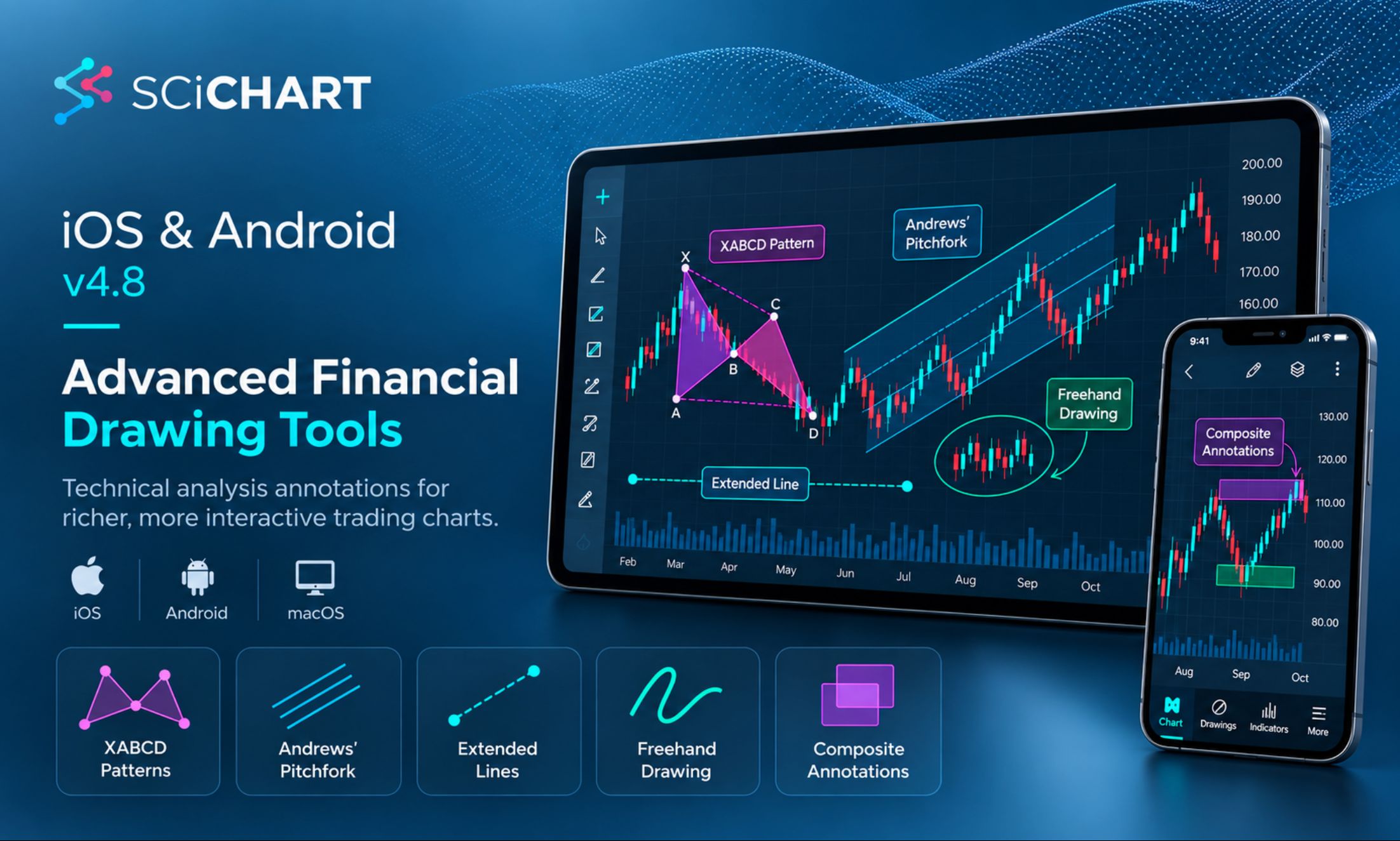
Building charts once and shipping them everywhere sounds simple - until you're maintaining separate rendering logic for web, iOS, Android, macOS, and Windows, and your "unified" solution turns out to be a web-view wrapper in a native shell.The core problems for dev teams: duplicated charting code across platforms, web-view wrappers that choke on custom interactions and synchronized multi-chart views, and libraries that fall over once you throw dense, streaming datasets at them (think financial tick data or industrial sensor feeds).The comparison is blunt about the popular options. Plotly leans hard on JavaScript, which shows up as real mobile performance bottlenecks. Highcharts is mature and accessible but web-centric at its core, so native mobile still means shipping a browser component under the hood. ECharts handles big datasets well and is fully open-source, but has no dedicated commercial support and the same browser-rooted architecture as Highcharts.SciChart takes a different route. At the core is Visual Xccelerator™, a proprietary C++ engine that renders natively against DirectX, Metal, OpenGL ES, or WebGL depending on the platform — no web-view in the loop, no browser component smuggled into your native app. That architecture is what makes handling up to 1 billion data points possible, backed by dedicated native SDKs for Android, iOS, macOS, WPF, and JavaScript instead of one implementation wrapped six different ways. Licensing is developer-based too, not per-seat or usage-based, so your bill doesn't spike the moment your user count does.For teams evaluating a charting stack, the practical takeaway is to test against your actual constraints - streaming data volume, true native rendering vs. embedded browser, and how licensing costs behave as you grow - rather than picking on ecosystem popularity alone.Curious how that stacks up against Plotly, Highcharts, and ECharts for enterprise-grade apps? Full breakdown here:Source: SciChart Blog — Best Cross-Platform Charting Libraries for Enterprise Apps

Why Enterprise Devs Are Rethinking Cross-Platform Charting
20 days ago

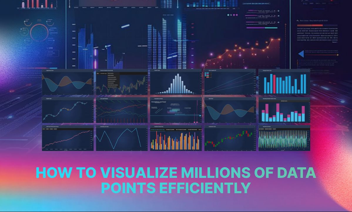
How to Visualize Millions of Data Points Without Slowing Down Your Dashboard: 5 Steps

Every dashboard looks fast until it isn't.Ten thousand rows, no problem. Then someone loads a full trading day, or a season of sensor data, and the browser tab just stalls. No error, no crash. It just stops feeling real time.This isn't bad luck. It's architecture.Most charting libraries were built around the DOM, not the GPU. SVG charts turn every data point into its own element, and the browser has to track all of them, so performance drops off once you're into the thousands. Canvas is a step up. It draws pixels directly instead of managing DOM nodes, which is why it comfortably handles tens of thousands of points. But it still runs on the main thread, so once you're animating hundreds of thousands of rows at once, the CPU becomes the bottleneck.WebGL is the real shift. It hands drawing to the GPU, which renders in parallel instead of one point at a time. That's the difference between a chart that chokes at 10,000 points and one that stays smooth well past a million.But raw rendering power only gets you so far. The libraries that hold up under real datasets combine it with two other techniques. Downsampling algorithms like LTTB reduce the number of points sent to the renderer while keeping every spike and sharp turn intact, so the shape of the data never gets flattened out. Level of detail rendering does the rest, keeping zoomed-out views light and letting zoomed-in views sharpen automatically, so nothing feels sluggish at any zoom level.Server-side aggregation can help too, but it's easy to overstate what it actually solves. It reduces what crosses the network. It doesn't touch what the browser has to draw once the data lands. That part is still, and always will be, a rendering problem.This is the exact challenge our engineers at SciChart work on daily, building for financial, medical and industrial applications where a stalled chart isn't just annoying, it's a lost trade or a missed reading. It's also why we've pushed SciChart.js far enough to test rendering a billion points in-browser without the dashboard turning into a slideshow.Full breakdown here: https://www.scichart.com/blog/how-to-visualize-millions-of-data-points-efficiently/

How to Visualize Millions of Data Points Without Slowing Down Your Dashboard: 5 Steps
10 days ago

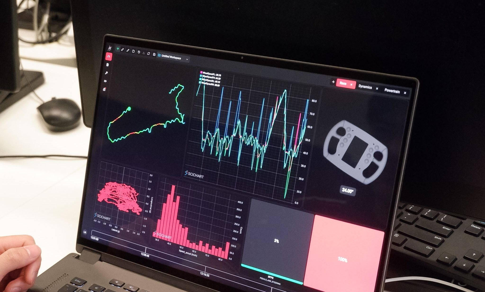
How Redback Racing Uses SciChart for Real-Time Motorsport Telemetry

How do Formula Student teams analyse large volumes of live vehicle telemetry without slowing down their engineering workflow?For UNSW Redback Racing, the answer was to rebuild its telemetry visualisation around SciChart.Redback Racing is the University of New South Wales’ Formula Student team, developing and racing an all-electric Formula-style car. During testing, engineers need to monitor large volumes of vehicle data in real time — from battery temperatures to powertrain performance — and then analyse that same data after each run.What problem was Redback Racing trying to solve?The team had built its own telemetry platform, Spyder, for monitoring and analysing vehicle data.As datasets grew larger and more complex, its original charting implementation started to become a limitation.To maintain acceptable performance, Redback Racing was using separate charting implementations for:Live telemetry during vehicle testingHistorical telemetry analysis after a runThat meant more code, more maintenance and greater complexity for the engineering team.Why did Redback Racing choose SciChart?Redback Racing integrated SciChart into its React-based telemetry platform to improve performance when visualising large and rapidly updating datasets.SciChart allowed the team to support both real-time and historical telemetry using a single charting component.Engineers gained:Fast real-time chart updatesSmooth zooming and panning across dense datasetsHigh-performance visualisation of long-duration telemetryA unified solution for live and historical data analysisThis simplified the architecture of Spyder while improving the experience for engineers using the system trackside.How does live telemetry replay work?One of the most useful capabilities Redback Racing developed was live replay.While a test session is still running, engineers can move backwards through the telemetry data to investigate something that has just happened.New telemetry continues streaming in the background.Once the engineer has finished investigating the event, they can immediately return to the current live data.For motorsport engineering, this is particularly useful because unexpected behaviour can be investigated during the test session rather than waiting until the run has finished.What changed after implementing SciChart?The biggest change was that chart rendering was no longer the performance bottleneck.Instead, the limiting factors moved further back into the telemetry pipeline, including the team's streaming architecture and hardware.For Redback Racing, that meant the engineering team could spend less time maintaining charting infrastructure and more time analysing the vehicle.The telemetry platform also became more reliable during test days, when engineers need data visualisation to work consistently and without interruption.Why does high-performance charting matter in motorsport?Modern race vehicles generate large amounts of telemetry.Engineers need to analyse that data quickly to understand vehicle behaviour, identify problems and make setup decisions.When charting software cannot keep up with the incoming data, engineers either have to reduce the amount of information displayed or build increasingly complex workarounds.Redback Racing's implementation shows another approach: using a high-performance charting engine capable of supporting real-time telemetry, historical analysis and live replay within the same application.The result is a simpler telemetry architecture — and more time for engineers to focus on improving the car.Read the full Redback Racing case study to see how SciChart is used inside the Spyder telemetry platform.

How Redback Racing Uses SciChart for Real-Time Motorsport Telemetry

About SciChart

SciChart: The world's fastest, high-precision charts and data visualisation for complex, bespoke, cross-platform applications.

With APIs for JavaScript, WPF, iOS and Android our ultra-high-performance data visualisation toolkits enable you to see the new opportunities for growth and performance improvement that would otherwise have been invisible.