
Over the past few years, you’ve likely noticed an increase in websites and applications featuring transitions that take place as you change page.
Perhaps it’s a simple crossfade between the current page and another when clicking a navigation item, or even something a little flashier like an image smoothly resizing.
While it might at times feel unnecessary, it can reduce the user’s cognitive load and reduce the perceived loading latency, improving the user experience in a subtle but meaningful way.
Long before becoming a standard feature for Chromium browsers, the technique became popular among users of frameworks and libraries like React. Their SPA-nature lent itself to the techniques, and so libraries like React Router made it easy to implement before it was introduced to the main library itself, experimentally, in early 2025.
As is often the case, frameworks abstract away complexity. This meant the buzz online around single-page and multi-page transitions was louder amongst frameworks fans than non-framework-based developers, for whom the learning curve was steeper given its lack of cross-browser support at the time.
With all of this in mind, we thought we would show you how to use the View Transitions API, to add some simple animations to a single-page application using just HTML, CSS and a sprinkling of JavaScript.
What’s the Big Picture?
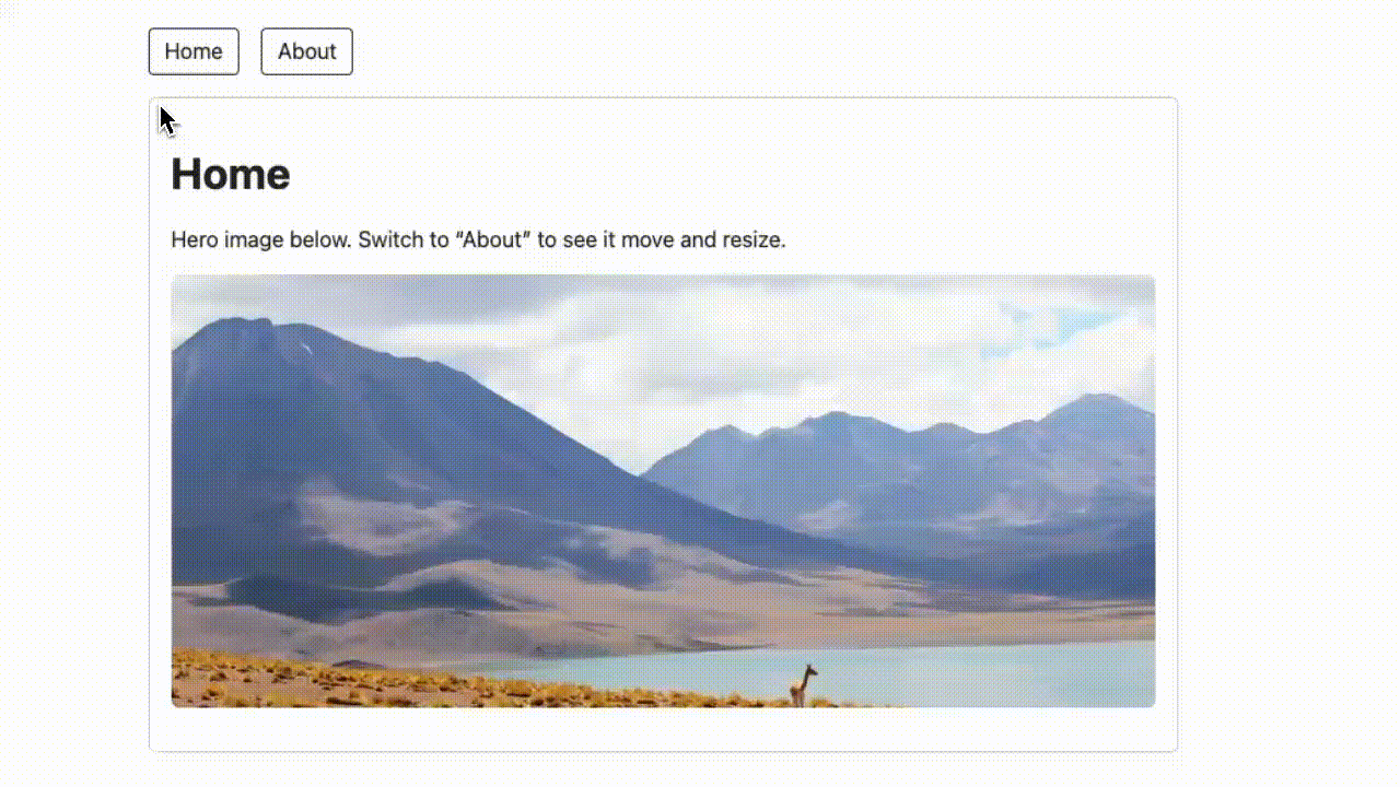
In this demo, we’re going to create a very simple single-page setup that looks like the GIF above, and works like so:
- A
<main>element, which acts as our “viewport.` - Each “view” lives inside a
<template>element. - When you navigate to a different view, JavaScript injects the template content into
<main>, replacing what was there before.
One more thing to note is that normally this would just snap from one view to another. But if we wrap that DOM swap in a document.startViewTransition(), the browser takes snapshots of old and new content and gives us a way to animate between them.
That’s the high-level view of what we’re going to do, so let’s get into it.
Wrap the Change in a Transition
At it’s core, this technique works because we use document.startViewTransition() to wrap a view change, telling the browser to:
- Take a snapshot of the current DOM
- Run our Router callback so the DOM changes
- Take a snapshot of the new DOM
- Animate between the two using CSS pseudo-elements, which we’ll get to in a moment.
document.startViewTransition(() => {
  /* A callback runs here which changes the
  contents of our <main> element */
});
Without this, the browser just swaps instantly. With it, we get access to pseudo-elements representing the old and new DOM, and the ability to style how they animate.
Fade the Whole Page
Let’s start off with the simplest effect we can, and fade the entire page between states, making use of those pseudo-elements we mentioned before, ::view-transition-old(root) and ::view-transition-new(root).
Let’s apply some CSS keyframe animations to them to customise our fade effect like this:
::view-transition-old(root) { animation: fade-out 200ms ease; background: #fff; }
::view-transition-new(root) { animation: fade-in  200ms ease;  background: #fff; }

@keyframes fade-out { to   { opacity: 0; } }
@keyframes fade-in  { from { opacity: 0; } }
So, the old page fades out, and the new one fades in on top. Straight-forward, and easy to understand
Morph a Specific Element
Fading everything is fine, but the real power of View Transitions is that you can call out specific elements to animate more intelligently.
This is done with the view-transition-name property. If an element in the old DOM and an element in the new DOM both share the same name, the browser links them and animates between them.
In the demo, both pages contain the same <img> element, but styled differently (the home view includes the hero class, the about view includes the right class.
Note: Admittedly, float probably wouldn’t be what we’d use to align images in the wild, but for this example it serves to show you that you don’t need to use the property on both <img> elements to animate it.
/* Mark the image as a morph target */
.image { view-transition-name: image; }

/* On the Home page it’s big and centered */
.image.hero  { width: 100%; height: 320px; }

/* On the About page it’s smaller and right-aligned */
.image.right { width: 340px; height: 170px; float: right; }
Because the browser sees .image with the same transition name on both sides, it automatically interpolates between size and position, smoothly shrinking and sliding to the right when you go to the About view.
Let’s Recap
So, to transition between states using HTML, CSS (and a touch of JavaScript), you simply:
- Swap the page content inside
document.startViewTransition(). - Animate the old and new root snapshots for a full-view transition.
- Use
view-transition-namefor element-specific transitions.
This demo focuses on a little single-page app setup. But you’re not limited to SPAs: the View Transitions API also works across full multi-page loads, which means you can add these same kinds of effects to classic multi-page websites, too. We’re going to get into this in another article in the near-future, or you can go and check out Google’s technical session on the topic from Google IO 2024.