
Every now and then it’s fun to build something small just to get a better grip on a concept, and this one’s a great example.
We’ll explore how to make a simple spotlight text effect that helps you understand how to follow the cursor, use CSS variables for dynamic styling, clip text with gradients, and create a mask that reveals part of the text as you move your mouse across it.
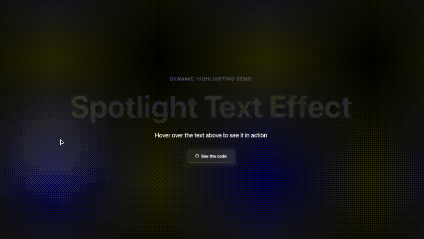
Below is a little preview of what we’ll make, and you can check out all of the code used in this article over on GitHub.
The Overview
The effect works by layering two versions of the same text:
- Base text — a dimmed version that’s always visible
- Overlay text — a bright version that’s revealed only through a circular mask that follows your cursor
The two layers combine to create a kind of light following the cursor illusion.
The HTML Structure
We’ll keep the HTML simple with just two identical spans that we can style independently.
<h1 class="hero-title">
  <span class="text-base">Spotlight Text Effect</span>
  <span class="text-overlay">Spotlight Text Effect</span>
</h1>
We could technically do this lots of different ways, perhaps using pseudo-elements, but having two layers makes it easier to focus on the actual spotlight technique.
Base Text Styling
We’ll start with the dimmed layer.
We’ve added a -webkit-background-clip: text in case you’d like to add a gradient, but we’ll go with a white background and a low opacity.
.hero-title .text-base {
  background: #ffffff;
  -webkit-background-clip: text;
  -webkit-text-fill-color: transparent;
  opacity: 0.1;
}
That gives us a faint white version of the text — just bright enough to see, but not enough to distract from the spotlight that will pass over it later.
Using CSS Variables for the Spotlight
Next we’ll use CSS custom properties (variables) to control the position and size of both the global cursor glow and the spotlight mask on the text. These variables will be updated in real time by JavaScript.
We start with a few defaults on the :root, that we’ll use later on:
:root {
  --cursor-x: 50vw;
  --cursor-y: 50vh;
  --spotlight-size: 300px;
  --text-spotlight-size: 200px;
}
Page-Wide Cursor Glow
Next we’ll handle the the cursor glow, a soft, blurred light that follows the mouse anywhere on the page (not just over the text).
It uses the --cursor-x and --cursor-y values to move:
.cursor-glow {
  transform: translate(
    calc(var(--cursor-x) - 50%),
    calc(var(--cursor-y) - 50%)
  );
  width: var(--spotlight-size);
  height: var(--spotlight-size);
}
This gives us the illusion of light moving across the screen, and also helps it to be more effective when added to an individual elements as we’re about to in the next step.
The Text Overlay
Now we’ll focus on the overlay layer, where the spotlight effect actually happens.
It’s simply a bright version of the text, but only a feathered, circular portion of it is visible at any time.
To achieve this, we use a radial-gradient mask whose center is controlled by --mask-x and --mask-y, two variables that represent the cursor’s position within the text element:
.hero-title .text-overlay {
  mask: radial-gradient(
    circle var(--text-spotlight-size) at var(--mask-x) var(--mask-y),
    black 0%,
    transparent 70%
  );
  -webkit-mask: radial-gradient(
    circle var(--text-spotlight-size) at var(--mask-x) var(--mask-y),
    black 0%,
    transparent 70%
  );
}
In short:
--cursor-xand--cursor-ycontrol the global glow--mask-xand--mask-ycontrol the local text mask
That’s all we need for the CSS. and we just need JavaScript to keep those variables updated.
Updating CSS in JavaScript
The JavaScript listens for mouse movement, then calculates two things:
- The absolute position of the cursor on the page (for the glow)
- The relative position inside the text element (for the spotlight)
document.addEventListener("mousemove", (e) => {
  // Update the global glow
  document.documentElement.style.setProperty("--cursor-x", e.clientX + "px");
  document.documentElement.style.setProperty("--cursor-y", e.clientY + "px");

  // Calculate cursor position relative to the text
  const rect = heroTitle.getBoundingClientRect();
  const x = ((e.clientX - rect.left) / rect.width) * 100;
  const y = ((e.clientY - rect.top) / rect.height) * 100;

  // Update the local mask variables
  heroTitle.style.setProperty("--mouse-x", x + "%");
  heroTitle.style.setProperty("--mouse-y", y + "%");
});
Because CSS variables can be updated live, the moment we change them here, the CSS mask repositions instantly - making the spotlight follow your mouse seamlessly.
By layering two identical text elements, a dimmed base and a bright overlay, with CSS properties dynamically updated with JavaScript, we gain a better understanding of how the two can share state in real time.