
So many of us developers use CSS every day, but the chances are we only use a very small portion of its features, and overlook many of its most fun ones.
You only need cruise Codepen to find some mind-bendingly impressive CSS-based projects using 3D environments, borrowing techniques from camera work and motion graphics and elsewhere, but it’s not necessarily a great place to actually learn how they work.
On a recent LIVE show we took a look at the amazing Scope Creep and it gave us the inspiration to play around with some CSS to try and achieve something similar.
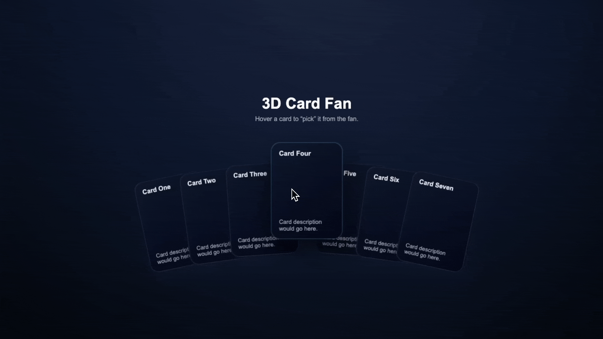
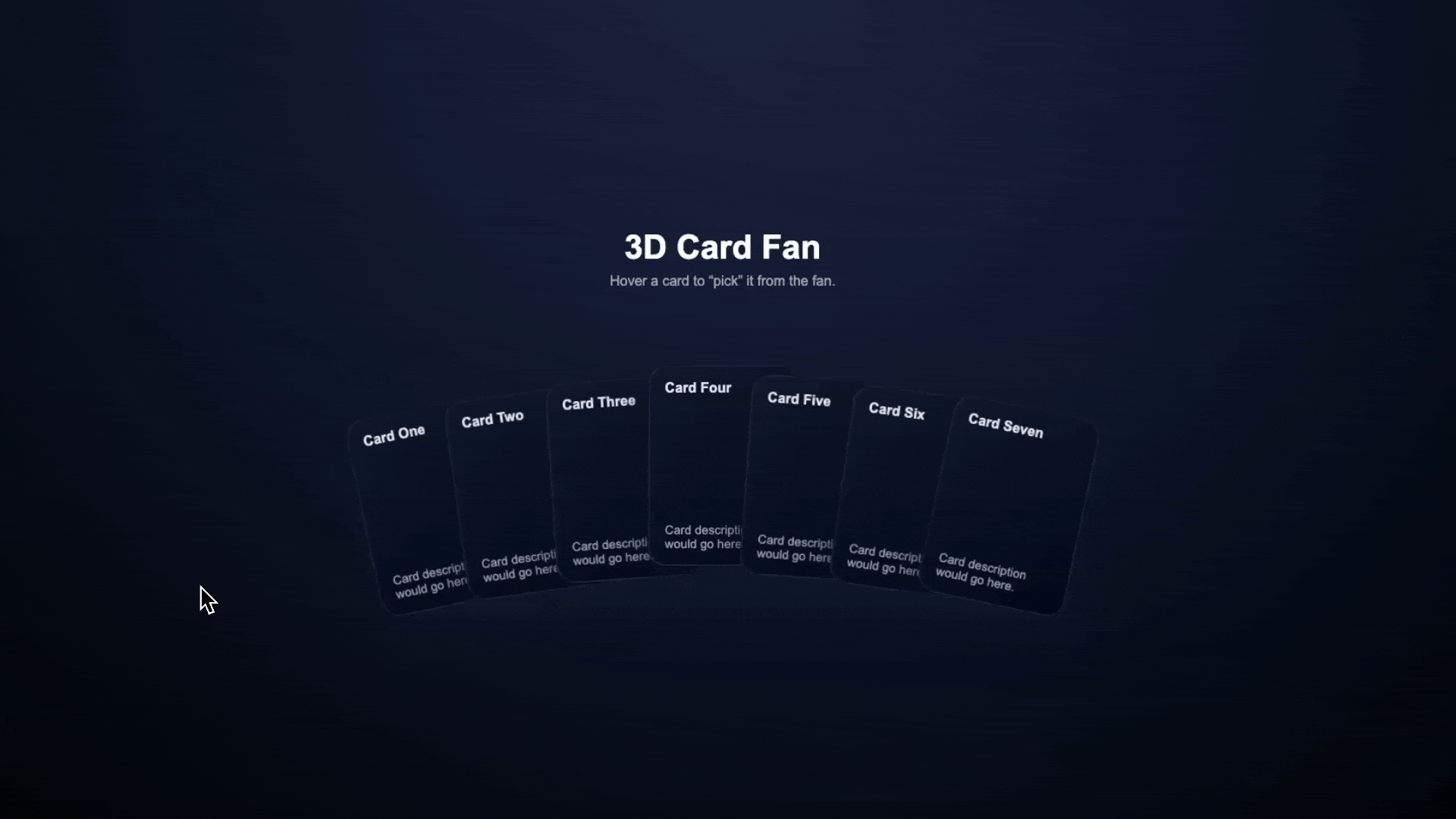
We’re going to create this 3D card fan with CSS transforms, perspective, and animation concepts coming together to create a component that looks nice and doesn’t use a single package or line of JavaScript.
You can get the code for this project over on the GitHub repo.
In this article, we’ll skip over the HTML so we can focus on the CSS, but essentially inside of our .card-fan we have a series of article elements with class .card.
Basic Styles
In terms of styling, let’s start of by creating the /css folder and a base.css file to handle global resets, page layout, and header styling. Because they’re not really central to this article, we’ll skip over these, but we set a nice radial gradient on the background, and some styles for our header text.
Then, the cards.css, is where we’ll add CSS transforms to create the subtly three-dimensional fan of cards.
Creating the 3D Environment
3D transforms in CSS are a lot of fun, but they can take a little while to get used to, especially if you don’t work with any kind of photography, videography, motion graphics or art and design.
CSS 3D transforms borrow concepts from photography and art. Just as a photographer sets up a camera to view a scene, we establish a perspective:
.card-fan {
  perspective: 1200px;
  perspective-origin: center center;
}
Here, you can see the difference when we change it to 300px:
The perspective sets the camera distance, which can be a little confusing. Larger values create subtle depth, smaller values create dramatic 3D effects. Secondly, perspective-origin is crucial, it defines the vanishing point, where lines meet.
Without it, the perspective effect can be imperceptible or misaligned.
Next, we enable 3D transformations:
.card {
  transform-style: preserve-3d;
  transform-origin: bottom center;
}
The transform-style: preserve-3d maintains 3D positioning for child elements, a bit like turning layers (and their children) to 3D layers in motion graphics software.
The transform-origin acts like an anchor point—where the card pivots. Setting it to bottom center makes cards rotate from their base, like real playing cards.
Working with Three Axes
When we hover over our cards, we’re going to want them to move towards the viewer (rather than just scaling it up), but keeping to the perspective of the entire component.
In order to do this, we’re going to use the third axis, the Z-axis. Rather than just moving our card horizontal on X-axis, or vertical on the Y-axis, we’ll move it closer to the viewer on the Z-axis.
Dynamic Positioning with CSS Variables
To position our cards along the path, spread out in an array, we can use the --fan-rotation-step CSS variable, then use this in a calculation later on.
:root {
  --fan-rotation-step: 4deg;
}

.card {
  --index: 0;
  --offset-y: 0px;
}
Each card also gets an --index (-3 to 3 for 7 cards) and --offset-y that creates the semicircle arc, and the --fan-rotation-step spreads the cards.
This will mean we can automatically set the rotation of each card, using rotateZ and calc to create the fan effect:
  transform: rotateZ(calc(var(--index) * var(--fan-rotation-step)))
    translateY(var(--offset-y)) translateZ(0px);
The translateY() moves the cards vertically, with the :nth-child() targeting them individually to move the cards in the center, upwards.
Then, the translateZ(0px) sets the initial depth of all of the cards.
Moving Cards in 3D Space
Finally, to create the animation, all we need to do is adjust the positioning along the Z axis with transform:
.card:hover {
  transform: rotateZ(calc(var(--index) * var(--fan-rotation-step))) translateY(
      calc(var(--offset-y) - 30px)
    )
    translateZ(60px);
  z-index: 10;
  transition: transform 260ms cubic-bezier(0.22, 0.61, 0.36, 1), box-shadow
      260ms cubic-bezier(0.22, 0.61, 0.36, 1), z-index 0s;
}
The translateZ(60px) moves the card closer to the camera. Combined with perspective, this creates depth. The card appears to lift off the table, and the z-index switch ensure the card you’ve hovered over comes to the front of the pack.
The same rotateZ() calculation preserves the rotation while moving forward, and we’ve added a delay to make it’s transition back into the pack smooth when we stop hovering.
Perspective and Depth
The relationship between perspective and translateZ determines how dramatic the depth effect appears. With perspective: 1200px and translateZ(60px), the card moves forward noticeably. The same translateZ with perspective: 600px creates a more dramatic effect—the card appears to move twice as far relative to the viewing distance.
This mirrors photography, because a wide-angle lens (with a smaller perspective) exaggerates depth, while a telephoto lens (larger perspective) compresses it.
Tweaking the Effect
You can fine-tune the effect by adjusting perspective (depth), perspective-origin (vanishing point), --fan-rotation-step (spread), translateZ on hover (lift), and the --offset-y values (the bend of the arc).
Admittedly, it can be quite complicated to predict the result you’re going to get when you’re tweaking these values, at least until you understand how it all works, but like most aspects of coding, it’s not as complicated as it seems as first.
The Final Product
There we go! The final product is complete, and ready to tweak as you wish.
In case you missed it earlier in the article, you can find all of the code featured here over on our GitHub, and be sure to let us know your thoughts over on socials.