
In websites and tech products, dark mode has become somewhat of a meme. It’s gone from a useful utility to a clichéd standard, sometimes shipped even before core features are finished.
In the past, styling applications so they would respond to the user toggling between light and dark mode would mean writing everything twice: a full set of colors for light, and another set for dark, wrapped in a @media (prefers-color-scheme: dark) block.
It works, but it can be tricky to maintain, isn’t particularly easy to read, and can very easily result in ‘gaps’ in styling, where specific elements do not change styles as expected.
While our VP of DevRel was putting together a CSS-only progress bar, we came across the perfect use case for an underused CSS feature we’d like to tell you all about. Before we do, let’s take a look at how developers handle dark mode at the moment.
The Media Query Way
For this section, we’re going to put frameworks like Tailwind to one side, and focus on the CSS-only approach that we see the most.
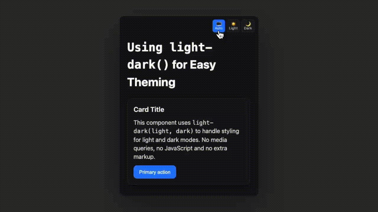
Let’s say we’re styling a simple card (shown below). If we wanted to add dark mode support, our HTML and CSS would probably look something like this:
<article class="card">
  <h2>Card Title</h2>
  <p>Some text inside the card.</p>
</article>
In our CSS, we would target the .card class with prefers-color-scheme to customise the card when the user has turned dark mode on:
.card {
  background: #fff;
  color: #111;
}

@media (prefers-color-scheme: dark) {
  .card {
    background: #141414;
    color: #f3f3f3;
  }
}
Even from this snippet we can see repetition with our code (as we repeatedly declare the .card class) and a separation of styles, making it harder for us to mentally understand which background colour we’re likely to see when we look at the site itself.
The light-dark() Approach
With the light-dark() function, you can handle styling with just one line.
To start-off, we add color-scheme: light dark to ensure the parent (and its children) are supported for both. Then, we can just declare light-dark() on any property we like, along with the colours we want for each mode, like so:
.card {
  color-scheme: light dark; /* declare support for both */
  background: light-dark(#fff, #141414); /* #fff on light, #141414 on dark*/
  color: light-dark(#111, #f3f3f3);
}
That’s it! The browser picks the right branch automatically based on the user’s theme, and renders the styles.
No bloated code, no JavaScript, no Tailwind, no duplication, no media queries.
See It In Action
So you can see how we’re using this in action, we’ve put together a demo (with a toggle so you can switch between modes) over on CodePen.
Why We Prefer This Approach
We like this approach for three reasons:
- No duplication: each property is declared once, rather than multiple times as they are with media queries.
- Scoped: styles live nested inside the component (
.card), not spread across global media queries, littered throughout your CSS. - Cleaner mental model:
color-schemedeclares intent,light-dark()handles the choice, so you can confidently predict how styles will render while in each mode.
We hope you find this useful, and we’d love to hear about some of your favourite CSS tips and tricks so be sure to send them our way!