
If you’re a web designer or content creator, data visualisation is something you probably think about a lot. When you’re dealing with interesting data you want to be able to communicate that in a visual way that helps people quickly understand what you’re talking about. And for the longest time graphic designers have helped turn those spreadsheets into good looking images. But now there are some powerful JavaScript charting libraries that produce great looking charts which go above and beyond the limitations of a jpeg or png.
Since the barrier to entry to access these libraries is now incredibly low thanks to ChatGPT and its ability to code — anyone can now create great looking charts for a webpage or website with relative ease. So this article will not only benefit web designers or frontend developers, but also creators who understand the basic coding.
The top JavaScript charting libraries
How do we determine what the top JS charting libraries are? The State of JS surveyed over 20,000 developers and asked them what JS library they use. So we’ve taken the top five libraries and added two more that might also be interesting for you. Keep in mind that usage does not equal most loved.
All except one of the following javascript charting libraries are free and accessible to anyone. Your main limitations will either be your CMS (which might not make room for customisable code), your skill with JavaScript and web design, and what frontend framework you are using. We won’t dive super deep into the code with this article, instead, we’ll focus on the different styles and unique chart types for each library. We’ll provide bar and line graph examples for each example.
1. Charts.js
Chartsjs is the highest voted javascript chart library in the State of JavaScript 2022 with a lot of developers finding it useful to quickly create Charts. The library is simple and doesn't require a lot of coding. You’ve got the main types of charts to choose from which all look quite nice with a distinctive style. The tooltip is one of the standup visual elements, it makes it a little more interactive for the user who can hover over the graph and see the different data points. Now, let’s take a look at some examples.
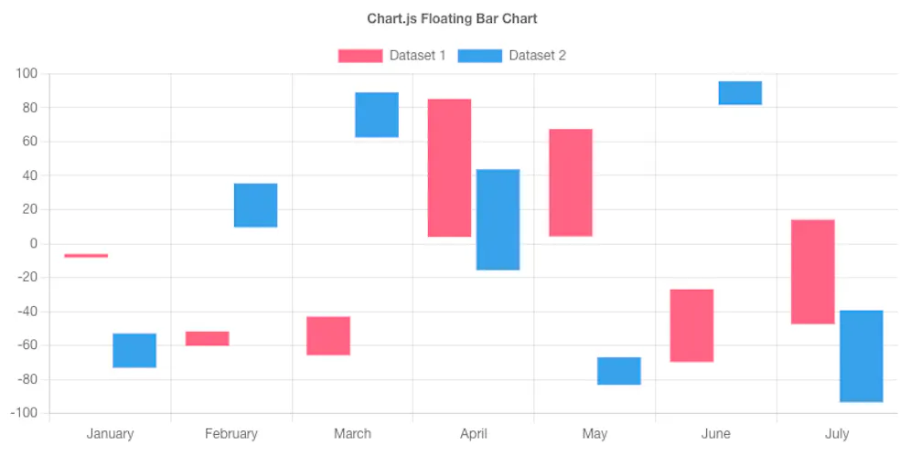
a. Bar
The bar charts often have a border effect — a distinctive style of this library. The tooltip, the legend, and the action buttons are some of the elements you can use to make the graph more interactive. Click on the legend and you can hide data, add actions to the bottom of the graph so that users can change how the data is organised. And the tooltip is also customisable so you can add more data comparison there if you’d like.
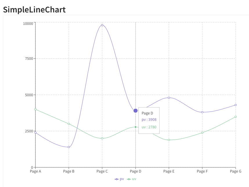
b. Line
We’ll just use a simple line graph here with two data sets so you can get an idea of how it’ll look on the webpage. Again, you can hover over each plot point and you’ll see the tooltip with the data. The X and Y axis labels can be removed for a cleaner look. You can also hide the legend which actually gets a bit clunky when you have a lot of datasets.

2. D3
D3 is the second most used javascript chart library and you’ll see why in a second. Where Chartsjs is simple and offers somewhat predefined templates, D3 offers the full degree of customisation. This makes the library more complex since you’ll have to define a lot more data but this means you can really do some cool stuff with a bit more time spent. D3 is also one of the original charting libraries, so there are also a few other libraries built on top of D3 like Nivo (React) and Plotly (Python).
a. Bar
This is a really basic bar chart and doesn’t do the library justice since D3 is not recommended for displaying simple charts. (Our CMS doesn't have the capability of running these more complex charts). Take a look at the Bar Chart Race to get a better idea of how D3 animates data — it’s such an awesome way of displaying multiple datasets over time. The world tour chart is also epic, you’re probably only going to use something like this once but it sure looks great from a visual perspective.

b. Line
You might be able to see the amount of data that goes into this simple line chart compared with something like Chartjs so, again, not recommended for simple charts. There’s no tooltip, and the data graph isn’t really interactive from the outset. The D3 charts are like that central point of a report — so much data packed into one graph.

3. Highcharts
At number three, we have Highcharts which is the only paid javascript chart library on this list. The first thing you’ll notice is that the style of charts is very clean and professional. Personally, the layout of the line and area charts are some of my favourites — very reminiscent of charts you’d find in a textbook or academic publication. Not only do the charts look great but the interactive features are top notch (I would say better design than Chartsjs). You’ve got the tooltip, the datasets which can be hidden, and then a highlight feature when you hover over the data. We’ll show what the bar and line charts look like, but we encourage you to check out all of the line chart demos as well as the area charts, that’s where Highcharts does a really great job.
a. Bar
This is a standard stacked bar chart with three datasets. With a lot of the other libraries, it feels like the X and Y labels get in the way, take up space, and just don’t sit right but with this style it works quite well. You can change the background (six presets) so that you can match your chart better with your web page or report. You can also create the bar race with this library although the D3 template is better.
b. Line
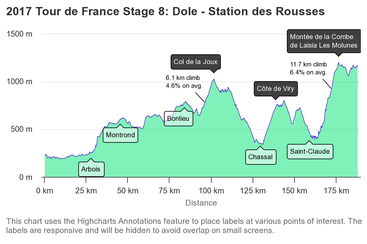
Here’s a simple line graph with three data sets. By clicking on the legend you can switch the datasets off and on, plus there’s the hover tooltip. The thickness of the lines can be adjusted separately to better differentiate the datasets. You can also change the shape of the plotted points, for example in the graph below you’ll see circle, diamond, and square. You can see a really cool example of a highly customised line chart (altitudes in France) below.
Example 1:

Example 2:
4. SciChart
At number four, we have SciChart, a commercial JavaScript charting library that also offers a free community edition. SciChart is built as a high-performance visualisation library, designed for real-time, high-frequency, and high-volume data where precision and responsiveness matter. While some libraries emphasise strong default styling, SciChart focuses on clear, information-dense visualisation, giving developers the tools to create charts that remain readable and visually coherent even as complexity increases.
Compared to libraries with more opinionated default styling, SciChart places a stronger emphasis on customisation and flexibility, allowing developers to define how charts look and behave to suit specific application needs.
It is used across web, desktop, mobile, and embedded environments, providing a consistent charting foundation regardless of platform or framework. You can explore the full range of chart types and examples in the JavaScript demos gallery.
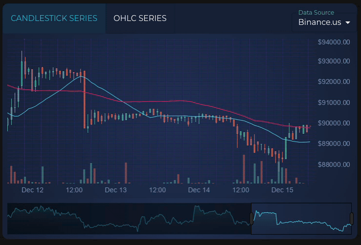
a. Candlestick
The financial candlestick chart demonstrates SciChart’s approach to dense, time-based data. It supports interactive features such as zooming, panning, tooltips, and overlays, allowing users to examine price movement and trends in detail without sacrificing clarity as more data is added.
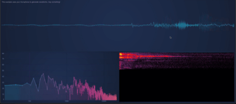
b. FFT / Audio Analysis
SciChart also supports specialised charts such as real-time FFT audio analysis, which visualise frequency-domain data as it updates continuously. This type of chart is commonly used in technical and scientific contexts and shows how SciChart handles visualisations where accuracy and smooth updates are essential to understanding the data.
You can read more about SciChart in the in-depth article The Fastest JavaScript Charts - Built for React and Beyond and learn from the creators on our podcast in the episode Uncharted Territories of Web Performance.

5. Recharts
Recharts is appealing for those looking for a simple, no flare way of presenting data. The style is very economical and clean. You’ll find all the classic charts in this library but nothing like the stunning charts from D3 or Highcharts. Personally, I think the pie charts and radar charts are the strongest charts in this library. The pie charts have a loading animation while the radar charts just look clean and professional.
a. Bar
Recharts is a React library so we’ll just have to use screenshots for the following examples. Below is an example of the Recharts bar graph. As you can see there’s a tooltip but unlike the other libraries mentioned you cannot hide datasets from the legend.

b. Line
The line chart is a very simple and clean design. You can add plot points, change the shape of the plot point, annotate plot points, and highlight-and-zoom. And that’s basically it, like we mentioned, it’s a barebones library.
6. Mermaid
The Mermaid library has a very different use case from every other javascript chart library that we’ve talked about. It’s not for line or bar graphs but for displaying diagrams on a website written in code. They look really cool. It’s great for displaying relationships between entities and sequences. Here are a few examples from their site so you can get an idea of what you can create using this library.
Sequence:

Four Quadrant Square Chart:

Diagram:

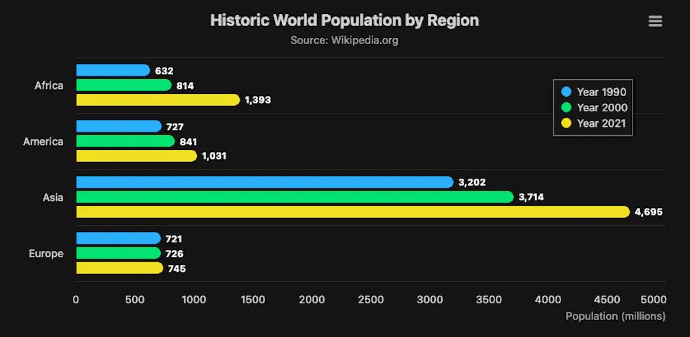
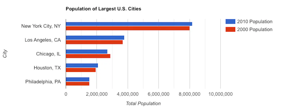
7. Google Charts
Google Charts was not featured in the State of JavaScript 2022, but I’ve added this to the list because I think this library is a good alternative to Chart Js — I think the bar graphs and pie charts look better from this library. You might disagree, that’s totally fine, but still it’s worth taking a look at the different style of this library. What is unique about the Google library are the Geomaps — similar to what you’d find on your Google analytics dashboard.
a. Bar
If you’ve worked with Google products like Sheets or Docs and created charts, it’s the exact same style. The only difference is the tooltip. The benefit is that it’s a very compatible style on any webpage and it’s easy to customise the code. If you’re displaying simple data go with this library or Charts.js, depending on what style you like better.
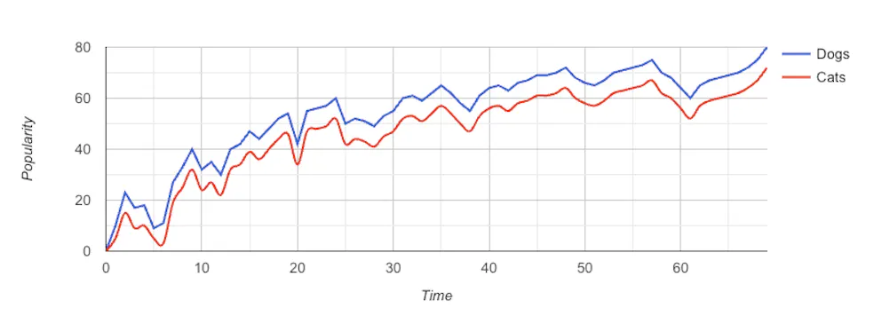
b. Line
Again, really simple design with moderate customisations. You can hide the legend if you like, add a subheader, add X and Y axis labels, smooth the lines, and a few other things.
Where to start?
Most of these javascript charting libraries are free to use so you can experiment with your own data to see what looks the best on your webpages. ChatGPT does a really good job at inputting your data into these different charts so you can experiment at a very high frequency.
The best place to start is by looking through these js charting libraries and finding one that matches the style you are looking for and also the chart type because not every library has the same charts. If you are going to do something highly complex go with D3, it’s got some great looking templates. If it’s something more simple, you can try Google Charts or Charts.js. Best of luck ✌️