
The Geometry of Incidents: Connecting User Impact to Architecture
- Discuss this with your agent
- Open in Claude
- Open in ChatGPT
This is a guest post by Bala Subrahmanyam Kambala, a Staff Platform Engineer at Oracle Cloud Infrastructure (also check out his blog). He is one of our speakers at the WeAreDevelopers World Congress North America and will present on Friday, the 25th at 13:30 on the Outside stage. Are you coming? How about if we give you a half price ticket?
I’ve read hundreds of postmortems from companies like Meta, Amazon, Cloudflare, and GitHub. Root causes vary, but some failure patterns repeat. Usually, an error breaks out of its blast radius boundary. Then, retry storms or cascaded restarts add massive load to a dependency that is already failing. In other incidents, the original problem is fixed, but some users remain affected.
I started using the term incident geometry to describe a way of examining these patterns: connecting the shape of user impact over time with the path a failure takes through the architecture.
The user-impact shape shows how many users were affected, how severely, and how that changed over time. The architectural path helps explain how the failure spreads, what amplifies it, and what allows recovery.
A good incident review may already explore these questions. I find it useful to bring them together and follow the connection explicitly.
When regional services fail together
On June 12, 2025, multiple Google Cloud and Workspace products experienced API errors across regions.
Service Control, which performs checks such as quota and policy enforcement, ran regionally and read from regional datastores. However, policy metadata replicated globally within seconds. One bad configuration update with blank fields triggered a hidden, broken code path. Then, Service Control instances started crashing in all regions simultaneously.
This code already passed a progressive, region-by-region rollout. But this broken path was never executed before because it required a very specific policy change to trigger it.
Recovery then introduced another problem. After the faulty path was disabled, restarting tasks overloaded a backing datastore in a large region. Smaller regions recovered earlier. Some dependent products continued recovering after Service Control itself was healthy. Google’s incident report
As shown in figure below, how the incident moved through three phases: a shared policy update spread the failure across regions, simultaneous restarts amplified it, and dependent products recovered later.
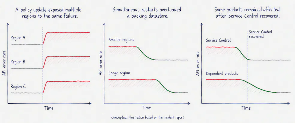
Each phase raises a different architectural question.
The first question is: Why didn’t regional boundaries contain the impact?
Looking at where a service runs is only part of the answer. We also need to follow the changes it consumes. Regional deployments can still share a failure condition when the same config or data reaches all of them together.
The next question is: Why did recovery cause further problems in some regions?
That directs attention to startup behavior, dependency capacity, and the work needed to restore each product. A recovery plan needs to account for the load it creates.
This is what I find useful about incident geometry. Each change in impact gives us a specific architectural question to investigate.
When stopping the damage does not restore the service
The Atlassian outage from April 2022 shows a completely different issue with recovery. Inside 23 minutes, one automated maintenance script deleted 883 sites for 775 customers.
Most customers were not impacted, but the affected sites remained unavailable for days.
As shown in the figure, the incident highlights the asymmetry of the outage: 883 sites were deleted in minutes, but restoring every customer environment took nearly two weeks.
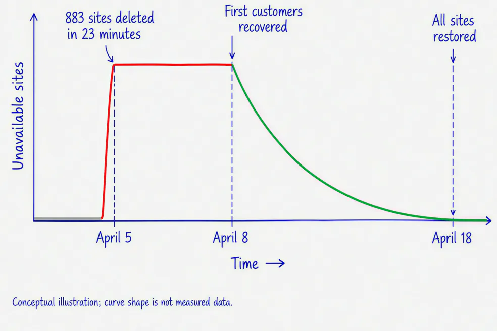
Atlassian could restore individual data stores and had experience recovering individual sites. It lacked an automated process for restoring this many sites across interconnected products. The initial recovery approach created new site identifiers, which required extensive remapping. A later approach reused the original identifiers and removed more than half the restoration steps. Atlassian’s post-incident review
Here, I would ask: What made recovery take so much longer than deletion?
That question leads beyond backup availability. It brings attention to the relationships that must be restored for a customer’s site to work: identity, configuration, product data, and dependencies between services.
The recovery tail becomes a reason to examine the unit of restoration. Is the tooling designed to restore a database, a service, or a complete customer environment? How much coordination is needed between those units?
How I would use this in a review
I would start with a simple impact sketch and clearly define what it measures. Failed requests, affected users, and unavailable sites can show different patterns during the same incident.
Then I would mark where the behavior changed and ask:
- Propagation: What allowed impact to reach additional users, services, or regions?
- Amplification: Did retries, failover, or recovery activity add to the problem?
- Containment: What stopped further spread, and which boundary held?
-
Recovery: What kept the remaining users from recovering?
A shape gives us a question to test against the incident evidence. A gradual rise might suggest accumulating pressure, but the report and system behavior must establish the mechanism. A long tail tells us to examine what remained difficult to restore.
That is the purpose of incident geometry for me: to make the connection between user impact and architectural behavior easier to examine—and to carry that understanding into the next design decision.