Kirsty Burgoine
Kirsty's Excellent Adventure in CSS Grid
#1about 1 minute
The evolution of web layout from tables to grid
Web layout techniques have evolved from table-based designs and floats to modern, powerful systems like Flexbox and CSS Grid.
#2about 3 minutes
Defining implicit and explicit CSS grids
An implicit grid is automatically created from content, while an explicit grid gives you precise control by defining columns and rows.
#3about 2 minutes
Positioning items using grid track lines and areas
Place and span items across the grid by referencing track line names or numbers with properties like `grid-column` and `grid-area`.
#4about 3 minutes
Using new units and functions like fr, repeat, and minmax
The `fr` unit, `repeat()` function, and `minmax()` function provide powerful and flexible ways to define responsive grid tracks.
#5about 4 minutes
Building responsive layouts without using media queries
Combine `autofill`, `repeat()`, and `minmax()` to create intrinsically responsive grids that adapt to available space without explicit breakpoints.
#6about 4 minutes
Creating full-width layouts with a no-wrapper approach
Apply CSS Grid to the entire page to create flexible gutters and allow specific elements to easily span the full viewport width without extra wrappers.
#7about 2 minutes
Designing complex editorial layouts with CSS grid
Leverage a page-level grid system to place content into complex, visually appealing editorial-style arrangements across multiple rows and columns.
#8about 5 minutes
Exploring the future of nested layouts with subgrid
The upcoming `subgrid` feature will allow nested grid containers to inherit and align with the track sizing of their parent grid.
#9about 2 minutes
Avoiding accessibility issues with content reordering
Changing the visual order of grid items with CSS properties can create a confusing experience for keyboard and screen reader users if it differs from the source order.
#10about 5 minutes
Manually supporting the legacy Internet Explorer grid spec
Supporting IE10 and IE11 requires using `-ms-` vendor prefixes and manually placing every grid item due to the lack of auto-placement.
#11about 3 minutes
Using modern tooling and fallbacks for IE support
Use Autoprefixer with `grid-template-areas` for partial IE support, or use the `@supports` rule to provide a simpler Flexbox or block layout fallback.
#12about 2 minutes
Key takeaways and the power of CSS grid
CSS Grid is a powerful, well-supported, two-dimensional layout system that enables flexible and complex designs with less code.
Related jobs
Jobs that call for the skills explored in this talk.
Matching moments

04:39 MIN
The long journey to modern CSS layout and responsive design
The State Of The Web

04:56 MIN
Current challenges and the future direction of CSS
WeAreDevelopers LIVE - Yes, CSS Can Do That!
02:16 MIN
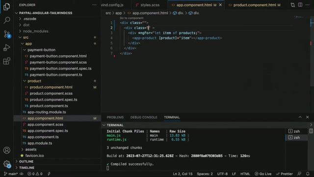
Arranging components with the Tailwind grid system
Level up your Angular CSS with Tailwind CSS

05:24 MIN
Adapting print design principles for the fluid web
WeAreDevelopers LIVE - Web Typography; CSS Layout features; Staying curious in an AI world and more
05:26 MIN
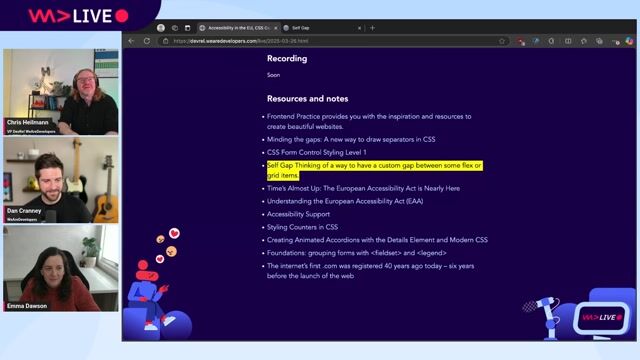
Managing custom gaps in CSS flexbox and grid layouts
WeAreDeveloper Live: Accessibility in the EU, CSS Gaps and forms with Emma Dawson

05:42 MIN
How to get developers to use a design tool
Building Collaborative Open Source tools for Developers and Designers - Pablo Ruiz-Muzquiz from Penpot
04:55 MIN
Core techniques for writing robust and resilient CSS
Future-Proof CSS
04:52 MIN
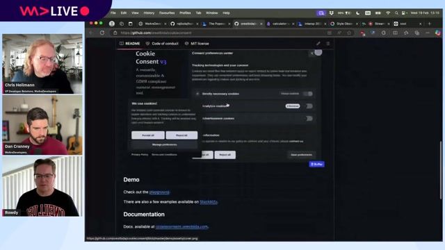
Interactive tools for learning CSS and visualizing data
New Browser APIs, End of React Create App, Smuggling Data in Emoji and more with Rowdy Rabouw
Featured Partners
Related Videos
 59:20
59:20What's new in CSS for Designers?
Onur Gumus
 28:00
28:00Can CSS recreate Tufte's designs?
Håkon Wium Lie
 1:04:00
WeAreDevelopers LIVE - Yes, CSS Can Do That!
Chris Heilmann, Daniel Cranney & Zoran Jambor
 59:11
59:11WeAreDevelopers LIVE - CSS is DOOMed
Chris Heilmann, Daniel Cranney & Justin Halsall & Christian Schaefer
 1:06:20
WeAreDevelopers LIVE – Frontend Inspirations, Web Standards and more
Chris Heilmann, Daniel Cranney & Jan Deppisch
 44:29
44:29Playing Games with CSS
Elad Shechter
 09:04
09:04Tips and Tricks: CSS Pseudo Class Selectors and Pseudo Elements
Dan Cranney
 35:15
35:15Extensionator - Rise of the Chromium
Keren Kenzi
Related Articles
View all articles


From learning to earning
Jobs that call for the skills explored in this talk.

Nigel Wright Group
Intermediate
CSS
HTML
JSON
REST
Scrum
+1

Randstad UK
Charing Cross, United Kingdom
£30-40K
PHP
HTML
WordPress
JavaScript

GYMSETS LTD
Byley, United Kingdom
£40K
CSS
GIT
HTML
JSON
+2


Frontier Resourcing
Southampton, United Kingdom
£50-80K
GIT
React
Vue.js
Node.js
+4

Frontier Resourcing
Cardiff, United Kingdom
£50-80K
GIT
React
Vue.js
Node.js
+4
